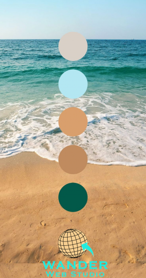
You spent six months in “brand therapy.” You survived the mood boards, the focus groups, and the endless debates over whether your company’s blue should feel like “Pacific Midnight” or “Electric Sapphire.” Finally, the agency delivered it: the perfect logo. It looks stunning on your business cards. It pops on the lobby sign.
Then, you hand it over to your web team, and something goes horribly wrong.
On a MacBook Pro, your brand blue looks like it’s glowing. On a Dell monitor, it looks muddy. And when your marketing VP tries to read the white text over that secondary “Soft Sand” color on her iPhone, she can’t see a thing.
For a midsize business, this isn’t just a design “oops.” It’s a trust-killer. In the digital world, color is the shorthand for your company’s competence. If your colors feel “off” or hard to read, users subconsciously wonder if your product or service is “off,” too.
As a web developer, I’ve seen this “Brand Translation Disaster” dozens of times. Here is how we bridge the gap between your physical brand and a high-performance, web-perfect digital presence.
The first thing every business owner needs to understand is that your monitor and your printer are two different species.
Printers use CMYK (Cyan, Magenta, Yellow, and Black). It’s a “subtractive” model—ink is layered on paper to block light. Screens use RGB (Red, Green, Blue). It’s an “additive” model—the screen is literally shooting colored light into your eyeballs.
The Statistics of First Impressions
Wander’s Wisdom:
I once worked with a mid-sized manufacturing firm whose brand color was a deep, rich forest green. In print, it looked sophisticated. On the web, the initial developer used a direct conversion tool, and the result was a neon-tinged shade that looked like a 1990s arcade game. The CEO was baffled. The “fix” wasn’t to use the code the printer gave them, but to manually adjust the Saturation and Brightness so the light-based version felt like the ink-based version.
For a company of your size, web accessibility isn’t just a “nice-to-have”—it’s a legal and ethical imperative. The WCAG (Web Content Accessibility Guidelines) are the gold standard here.
The most common disaster? The Contrast Fail.
Your brand agency might love the look of light grey text on a white background. It looks “minimalist.” But to a user with visual impairments (or even someone outside in the sun on a mobile device), it’s invisible.
The Rule: To meet WCAG 2.1 AA standards, your body text needs a contrast ratio of at least 4.5:1 against the background.
Wander’s Wisdom: Don’t guess. Use a tool like Adobe Color or WebAIM. If your brand’s secondary color is a pale pink, we don’t use it for text. We use it for a border, an icon, or a background—never for the “meat” of your message.
Your logo probably has two, maybe three colors. If you try to build a 100-page enterprise website using only those three colors, you will end up with a visual nightmare.
A web-perfect brand requires a Utility Palette, this includes:
This is your Call to Action (CTA). If your logo is blue and orange, and you use blue for the header, blue for the links, and blue for the “Buy Now” button, the button disappears.
Wander’s Wisdom: Pick one high-contrast accent color used exclusively for things you want people to click. If it’s everywhere, it’s nowhere.
Developers need “hover states.” When a user mouses over a button, it should change slightly to show it’s active. If you don’t provide a tint (lighter version) or shade (darker version) of your brand colors, the developer will guess. And developers—bless our hearts—usually guess wrong.
Your website needs to talk to users. It needs a “Success” green, an “Error” red, and a “Warning” yellow. A professional web-perfect brand kit ensures these don’t clash with your primary logo colors.
If your web team is still talking exclusively in HEX codes (like #FF5733), they are living in the past. To make colors truly “web-perfect,” we use HSL (Hue, Saturation, Lightness).
Wander’s Wisdom:
Why this matters for your SMB: HSL allows us to make “mathematical” design choices. If your brand blue feels too heavy on mobile, we can keep the Hue identical but bump the Lightness by 5%. This ensures brand consistency across different devices without creating a “flat” or “boring” UI.

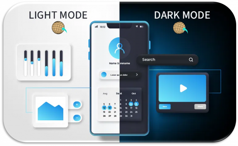
A huge percentage of your employees and your potential customers use “Dark Mode.”
The Disaster:
Your logo has a dark navy background. When the user’s browser switches to Dark Mode, your logo becomes a black square on a dark grey background.
The Fix:
We create “inverted” or “outlined” versions of your brand assets specifically for dark environments. We also “de-saturate” your primary colors for dark backgrounds. Vibrant colors that look great on white can actually “vibrate” or cause eye strain on a black background.
The biggest threat to a brand of 500+ employees is “Brand Creep.” This is when the HR department makes a landing page in one shade of blue, and the Sales team makes a deck in another.
Wander’s Wisdom: CSS Variables: Your Brand’s Insurance Policy
As a developer, I implement your colors as CSS Variables (or Design Tokens). Instead of hard-coding “#1A2B3C” into every page, we use a variable named –brand-primary.
At the end of the day, your website is your most active salesperson. It works 24/7. If that salesperson shows up with a wrinkled suit or mismatched shoes, people notice.
Taking your logo colors and making them “web-perfect” isn’t about changing who you are. It’s about translation. It’s ensuring that the passion and professional polish you put into your physical brand aren’t lost in the millions of pixels that make up the digital experience.
The ROI of getting this right?
Transitioning your brand from print to digital requires a strategic approach to color that goes beyond mere aesthetics. By mastering your logo colors for web accessibility and performance, you ensure that your first digital impression is as strong as your brand’s foundation. Don’t let poor contrast, technical debt, or slow-loading palettes hold your design back—optimize for the screen today. Whether you are looking to refine your user experience or ensure your digital assets are fundamentally secure, the team at Cocha Technology and Wander Web Studio is ready to help you scale with confidence.
Ready to see if your brand is web-perfect? Take a look at what we offer or contact us to start your 2026 digital transformation.
Virtual Office:
Based in Houston, Texas
Copyright © Wander Web Studio. All Rights Reserved.