Imagine this: a customer walks into your beautiful Houston web design office or browses your online shop. They spend time looking at your products, they pick up a few items, they even walk all the way to the checkout counter—and then, right as they reach for their wallet, they drop everything and walk out the door.
In the physical world, that would be heartbreaking. In the digital world, it happens every single minute. This is the reality of cart abandonment.
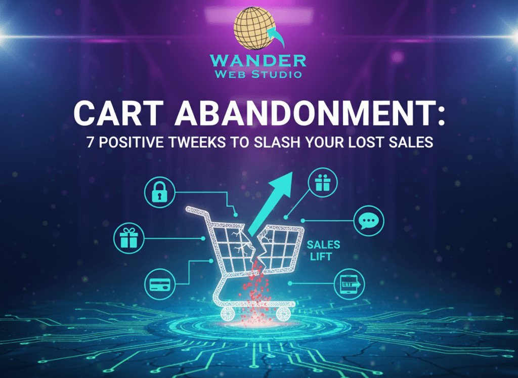
Recent data from the Baymard Institute shows that the average documented online shopping cart abandonment rate is a staggering 70.19%. That means for every ten people who find your site, love your brand, and want your product, seven of them are vanishing at the finish line. For a small to midsized business, recapturing even a fraction of those “almost” sales can result in explosive growth.
At Wander Web Studio, we believe that a high-performing site isn’t just about looking pretty; it’s about removing the friction that stands between a “maybe” and a “yes.” Let’s look at seven positive, high-impact tweaks to slash your abandonment rates today.
We’ve all been there—you want to buy a $15 candle, but the site insists you create an account, verify your email, and provide your mother’s maiden name before you can pay. This is the #1 reason for cart abandonment.
Forcing account creation is a massive barrier to entry. By offering a “Guest Checkout” option, you respect your customer’s time and privacy. Remember, you can always ask them to create an account or save their info on the “Thank You” page after the payment has been processed.
✦ Wanderer’s Wisdom: Get the sale first, the relationship second. Use user flows that convert to make the path of least resistance the path to your checkout. Once the transaction is done, they are far more likely to click “save my info” for next time.
Humans are hardwired to finish what we start, but we hate being left in the dark. If a user doesn’t know how many steps are left in your checkout process, they get “checkout fatigue” and bail.
A simple, clean progress bar (e.g., Shipping > Payment > Review) acts as a psychological “win” for the user. It gives them a roadmap and a sense of accomplishment as they move through the funnel. This is a core tenet of the psychology of web design that we implement for our global web design partners.
If your customer has to get up, find their purse or wallet, and manually type in a 16-digit credit card number on a tiny mobile screen, you’ve probably lost them.
By integrating Apple Pay, Google Pay, or PayPal Express, you allow users to complete a purchase with a single tap or a FaceID scan. This is the ultimate “Thumb Test” win. Whether you are selling to a local niche in San Antonio or shipping products worldwide, mobile convenience is no longer optional—it’s a requirement for high-level WooCommerce optimization.
There is nothing that kills a buying mood faster than reaching the final review page only to see $15 in “handling fees” and $20 in shipping added to the total.
Unexpected costs are the leading cause of cart abandonment. Be brave and be transparent. Display estimated shipping or tax as early as possible—ideally directly on the cart page—so there are no “shocks” at the finish line. Honesty builds the kind of brand authority that lasts.
Have you ever clicked “Submit” only to have the page refresh with three red error messages because you missed a digit in your phone number? It’s frustrating.
Inline validation provides real-time feedback (like a green checkmark) as the user types. This keeps the momentum going and prevents the “stop-and-start” friction that leads to frustration and abandonment. It’s a small technical tweak that makes your custom web design feel incredibly “premium” and attentive to the user’s needs.
Anxiety is a conversion killer. Right as the user is about to click “Place Order,” they often have a split-second thought: Is this site secure? What if I need to return this?
Counter this by placing SSL badges, “Secure Checkout” icons, and a brief mention of your return policy right next to the final button. This reinforces that your site is professionally managed through consistent WordPress maintenance and that you are a legitimate, trustworthy business.
✦ Wanderer’s Wisdom: Trust is earned in the small details. Working with a technical partner like Cocha Technology ensures your security protocols are always up to date, giving your customers the confidence they need to hit that buy button.
On your homepage, you want people to explore. In your checkout, you want them to focus.
One of the most effective ways to slash cart abandonment is to remove the main navigation menu from the checkout page. By “enclosing” the checkout, you remove the temptation for the user to click away to your “About” page or a different product category. Keep their eyes on the prize: completing the transaction.
Recapturing lost revenue doesn’t require a miracle; it requires a better user experience. By implementing these seven tweaks, you aren’t just “fixing a site”—you’re building a more profitable, human-centered business.
Every friction point you remove is a direct investment in your Website ROI. Your store deserves a checkout process that works as hard as you do.
Is your store leaking profit at the finish line? Contact Wander Web Studio today for a full Checkout Audit and let’s start turning those “browsers” into “buyers.”
Through our parent company, Cocha Technology Inc., we are officially multi-certified as: WBE | MBE | SBE | HABE
4321 Kingwood Drive, Suite 222
Kingwood Texas 77339
Phone: 281-607-0616
Email: info@wanderwebstudio.com
Operating on Central Standard Time (CST) | Serving Clients Across All Time Zones
Copyright © Wander Web Studio. All Rights Reserved.