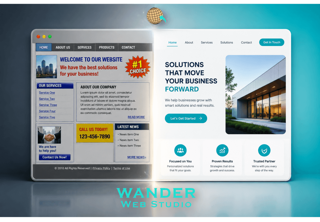
Part 1 covered the damage — what an outdated site is quietly costing you. Fair enough. But I don’t want to leave you sitting there just feeling bad about your website, because that’s not useful to anyone. Let’s talk about the fix instead. And here’s some genuinely good news: modern website design doesn’t usually mean tearing everything down and starting from a blank page. Most of the time, it’s more targeted than that.
I’ve seen business owners avoid updating their site for years because they assumed it meant a total, expensive, months-long rebuild. Sometimes that’s the right call, sure. But often? It’s a handful of specific, high-impact changes. Let’s go through them.
This is where I’d start, honestly, before touching colors or fonts or anything visual. Modern website design leans hard into simplicity — fewer menu items, clearer labels, an obvious path to the thing most visitors actually want (usually your services and a way to contact you). If your navigation currently has ten-plus items crammed into the header, that’s worth trimming before anything else.
We covered a version of this exact idea in our post on simplifying your user journey – fewer choices, presented more clearly, almost always outperforms more options crammed into less space.
You’d be surprised how much of “this site feels old” versus “this site feels current” comes down to just text size, font choice, and how much room everything gets to breathe. Older sites tend to cram content tight with small type. Modern website design gives things room — larger, more legible text, generous spacing between sections, less visual noise competing for attention at once.
This is genuinely one of the cheapest, fastest updates available, and it changes the entire feel of a page without touching a single word of your actual content.
If your homepage still features a stock photo of strangers in a boardroom laughing at a laptop for no discernible reason — and a lot of sites still do — that’s worth swapping out. Real photos of your actual work, your actual team, your actual space do more for trust than any polished stock image ever will, even if the real photos are a little less “perfect.” Perfect and generic reads as fake. Real and slightly imperfect reads as, well, real.
Old-style buttons tend to blend in — same color as everything else, buried at the bottom of a long page, easy to miss entirely. Modern website design treats your call-to-action as one of the most important elements on the page, not an afterthought. Clear contrast, obvious placement, language that tells someone exactly what happens when they click.
We broke this exact topic down in our post on visual hierarchy and your call-to-action – worth a look if you want the deeper mechanics of why this matters so much for conversions specifically.
Here’s a mistake I see fairly often: someone updates their desktop design, feels great about it, and never actually checks how it renders on a phone. A “modernized” site that still feels clunky on mobile hasn’t really solved the underlying problem, because that’s where most of your visitors are anyway. Any real modern website design pass must be evaluated on a phone screen just as seriously as a laptop screen — arguably more seriously.
Honestly, it depends, and I don’t think there’s a one-size-fits-all answer here. A few questions that can help you figure out which camp you’re in:
There’s real data behind prioritizing this, too — Stanford’s Persuasive Technology Lab found that nearly half of consumers judge a website’s credibility based largely on visual design alone — layout, typography, color — long before they’ve read a word of actual content (source: CXL, First Impressions Matter: Make a Great One With Visual Design). That snap judgment either buys you the time to make your case, or it doesn’t.
If you’re leaning toward a targeted refresh rather than a ground-up rebuild, here’s a reasonable order of operations:
None of this needs to happen all at once, either. You could tackle this over a month, in stages, without ever taking your site fully offline or losing the momentum you’ve already built with search engines and existing traffic.
If it feels like more than you want to take on solo — which, fair, most business owners have an actual business to run at the same time — this is exactly the kind of focused work we do through our website redesign and development service. We look at what’s working on your current site, keep it, and rebuild around the parts that are quietly holding you back.
Modern website design isn’t about chasing every passing trend. It’s about making sure the first impression your site gives matches the business you actually are. That gap is more fixable than most people assume, once you know exactly where to start.
Turn your website into a high-performance business tool.
Through our parent company, Cocha Technology Inc., we are officially multi-certified as: WBE | MBE | SBE | HABE
4321 Kingwood Drive, Suite 222
Kingwood Texas 77339
Phone: 281-607-0616
Email: info@wanderwebstudio.com
Operating on Central Standard Time (CST) | Serving Clients Across All Time Zones
Copyright © Wander Web Studio. All Rights Reserved.