Let’s be entirely honest: you didn’t build your website just to have a pretty digital placeholder on the internet. You built it to drive action. Whether you want a visitor to purchase a product, book a strategy call, or download a premium asset, your ultimate goal is a conversion.
Yet, so many corporate websites treat their primary Call to Action (CTA) like a hidden Easter egg. They tuck their “Buy Now” or “Get Started” buttons into crowded menus, paint them in muted colors that blend into the background, or bury them beneath endless blocks of text.
If a user has to actively search your page to figure out how to give you their business, they won’t. They will leave.
In 2026, capturing consumer attention is a high-stakes battle. Human beings don’t read web pages line by line; they scan them in highly predictable visual patterns. If your design doesn’t immediately dictate what is important, your visitors will experience immediate decision fatigue. To maximize your revenue, you must use a results-driven website UX strategy 2026 that commands attention.
Here are five visual hierarchy secrets that will stop hiding your primary objectives and seamlessly guide your users from initial curiosity straight to the checkout line.
The human brain is hardwired to assume that bigger means more important. It sounds incredibly basic, but scale is one of the most underutilized business website conversion techniques in digital design.
If your primary CTA button is the exact same size as your secondary “Learn More” links or your standard text fields, it carries zero visual weight. To create an effective path, your target action must dominate its immediate surroundings.
According to prominent design interaction data published by the Interaction Design Foundation (IxDF), a clear size contrast immediately disrupts a user’s casual scanning pattern. When an element is significantly larger than the components around it, the eye is physically forced to pause there.
However, size is relative. Making a button gigantic won’t work if it’s surrounded by massive headers. True hierarchy requires a stark, intentional scale gap between your body text, subheadings, and actionable elements.
If everything on your page is screaming for attention, nothing gets heard. A common pitfall for growing brands is using their main brand color for absolutely everything—the background accents, the icons, the navigation links, and the buttons. This creates a visual wash where your conversion elements completely disappear.
To make your buy button unmissable, you must utilize an action color. This is a specific, high-contrast accent hue that is used exclusively for elements that move the user forward in the sales funnel.
[Monochromatic Design] ---> Button Blends In ---> User Hesitates ---> Lost Sale
[Isolated Accent Color] ---> Button Pops Out ---> Intuitive Click ---> Conversion
For instance, if your website relies on a cool, sophisticated palette of deep blues and slates—similar to the architectural layouts we build on our Wander Web Studio Services Page—your action color should live on the opposite side of the color wheel. A sharp, vibrant coral or a warm gold button isolated against a calm background acts as a visual lighthouse.
When business owners get nervous that a prospect might miss a piece of information, their default instinct is to crowd the screen. They pack text, badges, guarantees, and testimonials tightly around their primary button. Ironically, this layout density achieves the exact opposite result: it smothers the CTA and spikes user confusion.
To properly reduce cognitive load UX, you must give your primary actions breathing room. Surrounding a button with generous negative space (or white space) creates a powerful isolation effect.
Wanderer’s Wisdom: The Billboard Principle
Imagine driving down a highway at 70 miles per hour. If you pass a billboard that is packed with 500 words of text, three separate phone numbers, and five different images, your brain won’t register a single thing. You’ll just drive right past it. But if that same billboard is completely blank except for a massive, bold three-word phrase right in the middle, you will read it instantly. Your website works the same way. Your users are flying through your page at lightning speed. If you want them to click a button, clear away the clutter and let it stand alone.
When an element is isolated by empty space, it draws the eye like a magnet. We utilize this precise spacing framework across our custom developments, which you can see in action on our Wander Web Studio About Us Page, proving that “Lean and Mean” minimalism is a massive driver of user focus.
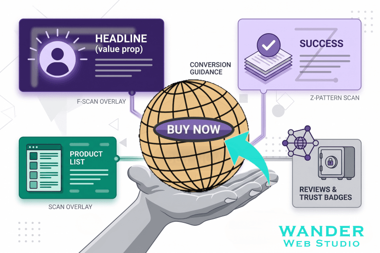
Eye-tracking research from the Nielsen Norman Group proves that western web users consistently scan digital screens in two primary shapes: the F-Pattern and the Z-Pattern.
The F-Pattern: Typically occurs on content-heavy pages like blogs or articles. Users read a strong horizontal line at the top, drop down slightly to read a shorter horizontal line, and then skim vertically down the left side of the page.
The Z-Pattern: Occurs on landing pages or minimal homepages. The eye travels across the top header, zips diagonally down to the bottom left, and then moves horizontally across the bottom right.
Z-PATTERN FLOW:
[Logo/Nav Link] -------------> [Top Right CTA]
      \
        \
          \
            \
[Visual Graphic] ------------> [Primary Buy Button]
To stop hiding your buy button, you must place your CTAs directly along these natural optical highways. Position a persistent, clear action link in the top right corner of your navigation bar (the end of the first Z-line), and repeat your primary action button directly at the center-bottom or bottom-right of your hero section. When your layout cooperates with human biology rather than fighting it, conversions feel entirely effortless.
Sometimes, the user’s eye needs a gentle physical nudge in the right direction. Explicit directional anchors—such as a subtle, animated arrow, a trailing background line, or a photo of a person looking directly toward a form—can radically alter user behavior.
Human beings are naturally social and deeply curious. When we see a photo of a person on a screen, our eyes instinctively follow their line of sight. If the person in your hero image is staring directly out at the user, the user stares back at them. But if that same person is photographed looking slightly to the side toward your contact form or your pricing button, they will instantly transfer the visitor’s focus directly to that functional element.
According to behavioral tracking data from ConversionXL (CXL), layouts that feature strong, explicit directional cues retain user attention on key value propositions for up to 44% longer than pages without visual pointers. It acts as an unwritten roadmap, ensuring that your core business objectives are never missed.
If your current digital metrics aren’t hitting your internal benchmarks, perform a simple “Squint Test” on your website today. Open your homepage, step back three feet, and squint your eyes until the text becomes a blurry smudge.
What stands out? If your eye is drawn to a background image, a giant block of corporate text, or a decorative icon rather than your primary action button, your visual hierarchy is broken.
Ready to stop losing revenue to confusing layouts and invisible buttons? Dive into our comprehensive Wander Web Studio Blog for more results-driven conversion tactics, or connect with our specialized team today to build a high-performance digital asset designed to scale.
Turn your website into a high-performance business tool.
Through our parent company, Cocha Technology Inc., we are officially multi-certified as: WBE | MBE | SBE | HABE
4321 Kingwood Drive, Suite 222
Kingwood Texas 77339
Phone: 281-607-0616
Email: info@wanderwebstudio.com
Operating on Central Standard Time (CST) | Serving Clients Across All Time Zones
Copyright © Wander Web Studio. All Rights Reserved.