You know that feeling when you walk into a store and something’s just… off? Maybe the lighting’s bad, maybe the shelves look like they haven’t been restocked in forever, maybe there’s a layer of dust nobody’s noticed. You don’t necessarily think “this business is bad.” You just quietly turn around and leave. That’s what outdated website design does. Nobody emails you to complain about it. They just close the tab.
I think that’s what makes this problem so sneaky, honestly. There’s no alarm bell. No angry customer calling to say “hey, your site looks like it’s from 2014.” They just… go somewhere else, and you never find out why.
So, let’s talk about what’s really happening when your design has gone stale, because it’s costing you more than most business owners realize.
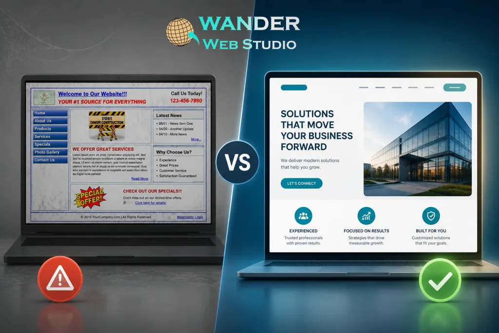
Fair or not, people read your website as a proxy for how you run your business. A site that looks like it hasn’t been touched in years — tiny, cramped text, awkward stock photos, a layout that clearly hasn’t been updated since smartphones got big — sends a message, even if it’s not one you intended. It says: if they let this slide, what else might they let slide?
That’s not really about aesthetics for their own sake. It’s about what dated design implies about attention to detail everywhere else.
Design isn’t just decoration, and this is where I think a lot of business owners get it wrong — assuming a redesign is purely cosmetic. It’s not. Outdated website designs often use layout patterns that fight against modern browsing habits: dense walls of text, buried navigation, no clear visual hierarchy guiding the eye toward what actually matters. People don’t read websites top to bottom anymore, they scan — and an old-style layout wasn’t built with scanning in mind at all.
Here’s an ironic twist worth sitting with. A lot of businesses with outdated sites have been around for a long time — that’s often exactly why the site is old, nobody’s touched it since launch. But paradoxically, that dated design makes them look newer and less credible than a business that just started last year with a fresh site. Age of the business and age of the design send opposite signals, and the design wins in a stranger’s first impression, every time.
This one’s almost a category of its own, honestly, and it deserves real weight. A lot of older sites were built “desktop-first,” back when that was the dominant way people browsed. Now, the majority of web traffic across most industries comes from phones. If your design was never rebuilt with mobile as the priority — not just “responsive,” but actually designed for a small screen first — you’re likely delivering a genuinely frustrating experience to most of your visitors without even realizing it.
Older design trends leaned heavily on cramming in as much as possible — busy backgrounds, blinking elements, sidebars stuffed with widgets, text in every available inch of space. None of that helps a visitor understand what you really do or why they should choose you. If anything, it drowns your actual message in noise. We wrote a whole piece on this a while back — white space is not empty space – and it’s genuinely one of the clearest markers between a dated site and a modern one: how much breathing room the design allows itself.
This is the piece I think most business owners haven’t connected yet. It’s not just human visitors judging your design — AI search tools are increasingly factoring in signals like site structure, freshness, and overall credibility when deciding what to recommend. A site that reads as stale and untouched doesn’t just lose the human visitor’s trust. It can quietly lose visibility in AI-driven recommendations too, since freshness and quality are part of what these tools weigh.
We dug into this shift in more depth in our post on website trust signals, if you want the fuller picture of how design and credibility are tangled together now.
Honestly? Sometimes it’s obvious. Sometimes you’re too close to it to see it clearly — which, I get it, happens to everyone with their own site. A few quick, honest questions:
If you find yourself nodding along more than once, that’s not a personal failing — it’s just what happens to any website over a few years. Design trends move, browsing habits shift, and a site that felt sharp when it launched can quietly fall behind without anyone doing anything “wrong.” It’s just entropy, honestly.
The good news is this is genuinely one of the more fixable sore spots on this whole list. You don’t always need to burn it down and start over — sometimes it’s a matter of a focused website redesign and development pass that keeps what’s working and updates what isn’t. Part 2 of this post walks through exactly how to modernize your design without blowing up your whole budget or starting from a blank page.
For now, the main thing worth taking away is this: outdated website design isn’t a minor cosmetic issue sitting quietly in the background. It’s actively working against you, every day, with every visitor who never tells you why they left.
Turn your website into a high-performance business tool.
Through our parent company, Cocha Technology Inc., we are officially multi-certified as: WBE | MBE | SBE | HABE
4321 Kingwood Drive, Suite 222
Kingwood Texas 77339
Phone: 281-607-0616
Email: info@wanderwebstudio.com
Operating on Central Standard Time (CST) | Serving Clients Across All Time Zones
Copyright © Wander Web Studio. All Rights Reserved.