One of the biggest mistakes business owners make when designing a website is trying to use every single pixel of “real estate.” There is a lingering fear that if a screen isn’t packed with information, it’s a wasted opportunity. They want to cram in one more button, one more paragraph, or one more flashy image to “maximize” the value.
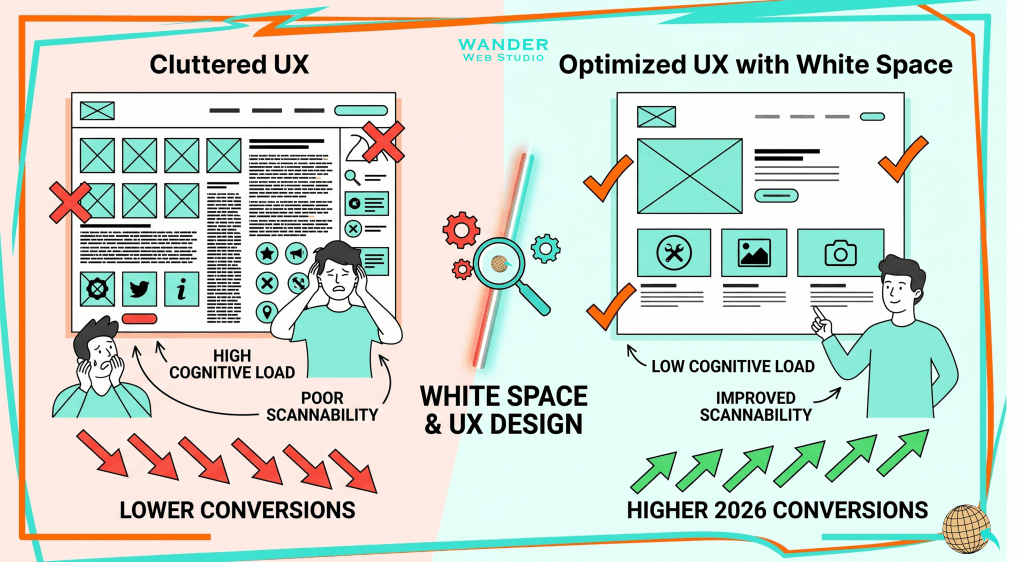
But in the world of high-conversion design, white space is not empty space. It is a powerful, active tool—a silent partner that guides the eye, reduces cognitive load, and tells the user exactly what is important. In 2026, scannability is the primary factor in whether a user stays on your site or bounces. If your design doesn’t have “breathing room,” the user’s brain will perceive the page as “work,” and they will instinctively leave. White space is the frame that makes your content look like a masterpiece rather than a garage sale.
When we encounter a page with ample white space, our brains feel an immediate sense of calm. This isn’t just an artistic preference; it’s rooted in cognitive psychology. High-density layouts trigger “Cognitive Overload,” where the brain struggles to identify which piece of information to process first. When everything is screaming for attention, nothing gets noticed.
Ample white space (also known as negative space) signals that the information is organized and easy to digest. This is essential for the proper Siloing of your brand message. By separating your “About Us” section from your “Services” with significant padding, you are physically manifesting the different categories of your business. You are giving the user’s brain a “micro-break” between concepts, which increases retention and keeps them from feeling overwhelmed.
We’ve talked before about The 5-Second Test, and white space is the engine that helps you pass it. If you have a massive value proposition buried in a sea of other elements, the user will miss it. By surrounding your “Call to Action” (CTA) with white space, you are essentially highlighting it with a digital neon sign.
It creates “Visual Hierarchy”—the arrangement of elements in a way that implies importance. According to research from the Nielsen Norman Group, using white space between paragraphs and in the left and right margins can increase content comprehension by up to 20%. This is because white space dictates the “Grouping” of information. In design terms, we call this the Law of Proximity: things that are close together are perceived as related. By using space to separate unrelated items, you prevent user confusion and direct them toward your most profitable actions.
We already know Why Nobody is Reading Your Website. In 2026, the average user is a professional skimmer. White space is the ultimate solution to the scanning problem. It allows the F-pattern scanning behavior to happen naturally and without friction.
If there is no space between your H2 sub header and your paragraph, the scanner’s eye gets “stuck.” They can’t quickly identify where one idea ends and the next begins. By increasing the line height (leading) and the space between blocks of text, you facilitate a “Layered Reading” experience. This is especially vital for your Mastering the Pillar Page strategy; long-form content must breathe, or it will be abandoned.
There is a fascinating phenomenon in UX design called the “Aesthetic-Usability Effect.” Users often perceive more aesthetically pleasing designs as being more usable and more trustworthy. A site that uses white space effectively looks expensive, professional, and confident.
Cluttered sites often look desperate; they try to tell you everything at once because they are afraid you’ll leave. A site with breathing room conveys authority. It says, “We know our value, and we don’t need to shout to prove it.” For a high-end service provider, this subtle psychological shift can be the difference between a high-ticket lead and a “price shopper” who bounces.
In 2026, search engines are increasingly looking at “User Signals” like Dwell Time and Pogo-sticking (when a user clicks a result and immediately hits “back”). If users stay longer because your site is easy to scan and pleasant to look at, your rankings will improve.
White space is not empty space—it is the foundation of a high-ranking, high-converting UX. By incorporating white space into your 4-Step Content Audit, you aren’t just making things “pretty”; you are technically optimizing for the behavioral metrics that Google’s 2026 AI agents prioritize.
To truly master this, we must look at the two types of white space:
At Wander Web Studio, we meticulously balance both. We ensure your Topics Over Keywords are delivered in a way that is easy on the eyes and the mind.
Wanderer’s Wisdom: I often have to fight the fear of “the white space” with new clients. They feel like they’re wasting space they paid for, like an ad in a magazine that’s half blank. I once designed a site for a high-end consultant who wanted every single service and testimonial on the homepage above the fold. We did a test: one version was his “busy” version, and the other had 30% more white space and a singular focus. The “clean” version saw a 50% increase in lead form completions. Why? Because the users could finally find the form. The space didn’t take away from the message; it gave the message a stage to stand on.
If your website is crowded, it is suffocating your message. By embracing the power of breathing room, you are respecting your user’s time and mental energy. You are moving away from the “noise” of the internet and toward a high-authority, high-conversion presence.
Is your website suffocating your message? Let’s add some breathing room to your design.
Turn your website into a high-performance business tool.
Through our parent company, Cocha Technology Inc., we are officially multi-certified as: WBE | MBE | SBE | HABE
4321 Kingwood Drive, Suite 222
Kingwood Texas 77339
Phone: 281-607-0616
Email: info@wanderwebstudio.com
Operating on Central Standard Time (CST) | Serving Clients Across All Time Zones
Copyright © Wander Web Studio. All Rights Reserved.