It’s a hard truth to swallow for any business owner who has poured their heart into their “About Me” page or a deep-dive blog: you spent hours crafting that copy, but the average visitor is only spending 15 seconds on the page. In 2026, the reality is clear: why nobody is reading your website is simply because they are scanning it.
With the sheer volume of information available in 2026, our brains have evolved a sophisticated defense mechanism against information overload. We seek out the “meat” and skip the “filler.” If your website looks like a “wall of text,” your visitors aren’t reading—they’re leaving. To capture attention today, you must design for the scanner first and the reader second.
Eye-tracking studies from the Nielsen Norman Group have shown for years that users read web content in an “F-Pattern.” They scan horizontally across the top (the headline), then a bit further down for a second horizontal movement (the first sub header) and then skim vertically down the left side of the page.
By 2026, this has evolved into “Layered Reading.” In this behavior, users jump between sub headers, images, and bullet points to find specific answers to their immediate needs. If your value proposition isn’t in those “hot zones,” it effectively doesn’t exist to the user. This is a critical component of Mastering the Pillar Page; if your pillar is not scannable, your entire content architecture fails to convert.
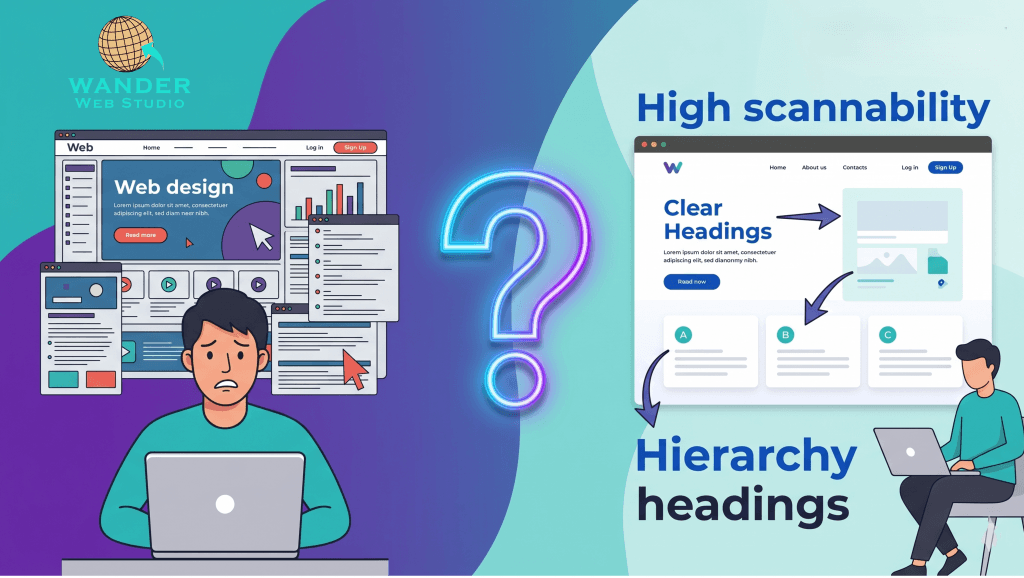
Understanding why nobody is reading your website allows you to pivot your design strategy. You have to stop treating your website like a novel and start treating it like a map. Instead of dense paragraphs that act as a barrier to entry, you must use:
Descriptive H2s and H3s: These act as signposts that tell the complete story even if the body text is entirely ignored. A user should be able to understand the value of your page by reading only the headers.
Bullet Points: For easy data digestion. If you have a list of three or more items, it should almost always be a bulleted list.
Bold Phrases: To catch the eye on the most important keywords and “anchors” within a paragraph.
Internal Links: Strategically placed links using Siloing principles to guide the scanner to the next logical step.
Google’s latest 2026 algorithms prioritize a concept called “Information Gain.” If a user scans your site and sees the same generic fluff they found on five other sites, they will bounce. To combat why nobody is reading your website, you need to provide unique insights—what we call “Wanderer’s Wisdom”—immediately.
When a visitor sees original data, a unique anecdote, or a direct solution in a sub header, they are 70% more likely to slow down and actually read the details. In a world of AI-generated noise, human-led “Information Gain” is your competitive advantage.
Over 60% of your traffic is likely on a mobile device, and on a mobile screen, the “Wall of Text” problem is magnified. A paragraph that looks “short” on a desktop (4 lines) can easily become a giant, intimidating block of text on a smartphone.
To fix why nobody is reading your website, you must adopt the “One-Idea Rule.” Keep paragraphs to 2-3 sentences maximum. Use white space to separate these ideas, giving the mobile skimmer’s thumb a place to rest. This psychological “breathing room” reduces cognitive load and encourages the user to keep scrolling rather than hitting the back button.
In 2026, users often look at the images and the text immediately surrounding those images before they read a single word of your body copy. This is why captions are some of the most-read real estate on your entire site.
Don’t just use stock photos as “decoration.” Use original graphics that illustrate your Topics Over Keywords strategy. When an image explains a complex concept at a glance, you’ve passed the scannability test. Captions should be treated as “Micro-Content” that summarizes the value of the section they inhabit.
The Cost of Friction:
Every time a user has to “hunt” for information on your page, you are introducing friction. In the 2026 attention economy, friction is a conversion killer. By designing for scannability, you are removing the barriers between your potential client and your solution. You are making it “easy” for them to realize you are the expert they’ve been looking for.
Wanderer’s Wisdom: I once audited a law firm’s site that had incredible, deeply researched articles. They were brilliant, but each page was a single, unbroken block of text. Their bounce rate was 90% because it looked like “homework” rather than help. We didn’t change a single word of their actual content; we just added white space, descriptive headers, and relevant images. Their “Time on Page” increased by 400% overnight. People finally realized how smart they were because they could finally scan the proof.
Designing for the scanner isn’t “dumbing down” your content; it’s respecting your user’s time. When you make your website easy to scan, you actually earn the right to be read.
At Wander Web Studio, we specialize in the intersection of high-end design and psychological scannability. We help you turn that “Wall of Text” into a high-converting roadmap that guides your visitors exactly where you want them to go.
Stop losing visitors to the “Wall of Text.” Learn how we design for scannability and keep your audience engaged.
Turn your website into a high-performance business tool.
Through our parent company, Cocha Technology Inc., we are officially multi-certified as: WBE | MBE | SBE | HABE
4321 Kingwood Drive, Suite 222
Kingwood Texas 77339
Phone: 281-607-0616
Email: info@wanderwebstudio.com
Operating on Central Standard Time (CST) | Serving Clients Across All Time Zones
Copyright © Wander Web Studio. All Rights Reserved.