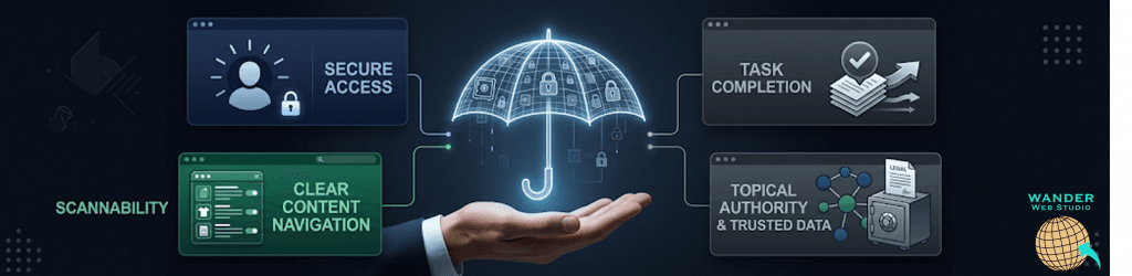
There is a distinct shift that happens when the sun goes down. The bright, high-energy bustle of the day gives way to something quieter, more refined, and undeniably premium. In the digital world, this atmosphere is captured perfectly by a design trend that has evolved from a developer-centric preference into an absolute hallmark of modern digital luxury: the midnight aesthetic.
When executed correctly, a luxury dark mode site does far more than just swap white pixels for black ones. It completely changes how a user interacts with your brand. It evokes a sense of prestige, commands deep focus, and offers an elegant canvas where high-quality product photography and sharp typography can truly pop.
But designing for the dark isn’t as simple as turning off the lights. It requires a deep understanding of visual contrast, color psychology, and modern website UX strategy 2026. Let’s explore how to master this premium visual landscape to captivate your audience and elevate your brand’s digital presence.
The single biggest mistake businesses make when implementing dark mode is using pure black (#000000) for the background and pure white (#FFFFFF) for the text. While it sounds intuitive, this extreme contrast creates a harsh visual vibration known as “halation,” which actually strains human eyes.
According to digital accessibility guidelines from the W3C Web Accessibility Initiative (WAI), high-contrast dark interfaces must balance legibility with visual comfort. Pure black body text on a white screen can be intense, but pure white text on a pitch-black background is often harder to read for long periods, especially for users with astigmatism.
[Pure Black #000000 + Pure White #FFFFFF] ---> Visual Vibration (High Eye Strain)
[Deep Slate #121212 + Muted Off-White] ---> Elegant Contrast (Low Eye Strain)
To create a truly premium look, your foundation should rely on deep, rich shades of gray, slate, or charcoal (such as #121212 or #1A1A1A). These dark, desaturated tones effectively reduce cognitive load UX by absorbing light rather than reflecting it, allowing the user’s eyes to relax. When the background is a soft midnight shade, you can use slightly muted off-whites for the body text, establishing an effortless readability that feels like a physical luxury editorial magazine.
In a traditional light layout, designers use drop shadows to indicate that an element—like a card or a button—is floating above the background. In a dark environment, however, shadows become completely invisible. To create a sense of three-dimensional depth on a dark canvas, you must use light layering.
The closer an object is to the viewer, the more light it catches. In premium web design, we elevate elements by applying progressively lighter surface colors to them.
Background Layer: Deepest, darkest slate (e.g., your master canvas).
Card/Component Layer: A slightly lighter shade of dark gray to show it sits on top of the canvas.
Hover/Active Layer: An even lighter tone or a subtle gradient to indicate interactivity.
When utilizing high-end website development services, this visual hierarchy is built directly into the site’s structural framework. This subtle play of light and shade guides the viewer’s eye through your content journey without requiring explicit instructions or loud, distracting visual markers.
A vibrant neon blue or a rich crimson might look stunning on a crisp white background, but dump those exact same saturated colors onto a dark slate canvas, and they will visually “bleed” and become incredibly difficult to process.
To design a successful luxury dark mode site, you must adapt your brand’s color palette specifically for a low-light environment. This means shifting toward desaturated tones or pastel variations of your core colors.
Wanderer’s Wisdom: The Gallery Lighting Effect
Think of designing a dark mode website like setting up a high-end art gallery. The room itself is dark, moody, and minimal. Why? Because the focus belongs entirely on the artwork. The paintings are perfectly illuminated by sharp, precise spotlights. Your website content should follow the exact same principle. Use your dark background as the quiet gallery space, and let your primary product images, portfolio shots, or key calls-to-action be the highlighted art pieces. When everything else is beautifully understated, the elements you want them to see will capture 100% of their attention.
When your accent colors are desaturated and applied with restraint, your primary photography takes center stage. This technique is highly evident on our own Wander Web Studio About Us Page, where premium layout structure meets intentional, high-performance visual aesthetics.
Data from the digital design network UXmatters indicates that dark mode interfaces can increase user focus and task engagement by up to 24% when visual clutter is eliminated and contrast ratios are meticulously balanced. By highlighting only what matters, you naturally guide the user toward your conversion goals.
If your brand is ready to embrace the dark side, ensure your team checks off these essential design principles:
Audit Imagery: Ensure that transparent images (.png files) don’t have hidden white borders or dark icons that suddenly disappear against a midnight background.
Prioritize Font Weights: Dark text on a light background naturally looks a bit thicker. When you reverse it, light text on a dark background can appear thinner and more fragile. Compensate by slightly increasing font weights or tracking (letter-spacing) to maximize legibility.
A beautifully optimized dark mode interface feels purposeful, intentional, and high-end. It tells your audience that you value their comfort just as much as your own visual presentation.
Is your website ready for a premium aesthetic upgrade? Explore our collection of design insights on the Wander Web Studio Blog for more cutting-edge UI trends, or reach out to our team today to build a captivating, high-performance platform tailored for your brand.
Turn your website into a high-performance business tool.
Through our parent company, Cocha Technology Inc., we are officially multi-certified as: WBE | MBE | SBE | HABE
4321 Kingwood Drive, Suite 222
Kingwood Texas 77339
Phone: 281-607-0616
Email: info@wanderwebstudio.com
Operating on Central Standard Time (CST) | Serving Clients Across All Time Zones
Copyright © Wander Web Studio. All Rights Reserved.