In the world of web design, we spend a lot of time obsessing over the “Hero Section”—that big, beautiful image and bold headline that greets you the moment a page loads. We polish the navigation menus and tweak the button colors in the middle of the page. But then, we get to the bottom, and for many businesses, the effort just… stops.
The footer is often treated like the junk drawer of a website. It’s where we toss the copyright date, a lonely “Terms of Service” link, and maybe a stray social media icon. But as a web designer and developer, I’m here to tell you that this is a massive, missed opportunity.
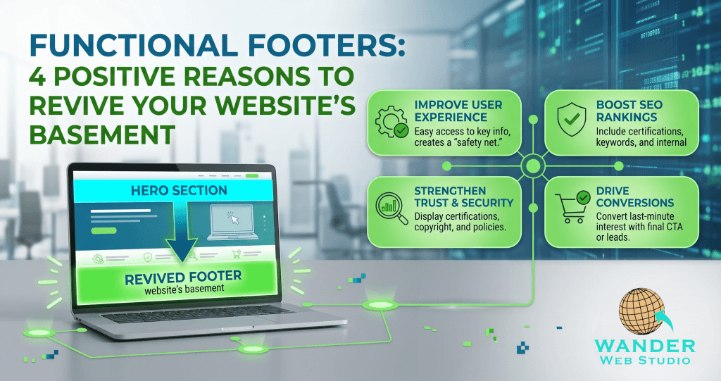
In 2026, functional footers are the unsung heroes of high-converting websites. They are the “safety net” for your user experience and a powerhouse for your search engine rankings. When someone scrolls all the way to the bottom of your page, they are telling you they are interested. Don’t reward that interest with a dead end.
Think about the last time you read a long, engaging blog post or a detailed service page. When you reached the bottom, what did you do? If the website simply ended with a copyright line, you probably hit the “back” button or closed the tab.
That is a conversion killer. Functional footers act as a safety net that catches the user before they leave your ecosystem. By providing a secondary, organized navigation menu, you give them a logical next step.
According to research on user intent, visitors who reach the footer are often looking for specific “utility” information—like your phone number, your physical address in Houston, or your managed hosting details. If you make them scroll all the way back to the top to find your menu, you’ve introduced friction. And friction is the enemy of a sale.
✦ Wanderer’s Wisdom: A great footer should always answer the question: “What now?” Whether it’s a link to your latest project or a simple “Book a Consult” button, never let a user reach the bottom of your site without a clear invitation to keep the conversation going.
From a technical standpoint, functional footers are an SEO goldmine. Because the footer typically appears on every single page of your site, the links you place there carry significant weight with search engine crawlers.
When we implement internal link siloing, we use the footer to reinforce your site’s hierarchy. By linking to your core custom website solutions or your specific service areas like San Antonio web design, you are telling Google: “These are the most important pages on my site.”
The footer is the perfect place to use keyword-rich anchor text that helps you rank for local searches. Instead of just saying “Services,” a functional footer might list “WordPress Development” or “Compliance Audits.” This helps search engines understand the breadth of your expertise without cluttering your main header navigation.
For a small to midsized business, the footer is often where you prove you are the “real deal.” This is where you house the trust signals that might feel too bulky for the top of the page.
In your footer, you should prominently display:
Certifications: If you are SBE, WBE, or SCTRCA certified, show those badges! They matter to procurement officers and corporate partners.
Security Badges: In partnership with our technical powerhouse at Cocha Technology, we often include security seals that reassure users their data is safe.
Social Media Incorporation: Don’t just link to your profiles; show them. An integrated feed or a clear set of icons proves your business is active and engaged in 2026.
I once worked with a client who had incredible testimonials but hid them on a page that nobody visited. We moved a “Rotating Testimonial” widget into their footer, and their inquiry rate jumped significantly. Why? Because users saw social proof at the exact moment they were deciding whether to stay or go.
The challenge with functional footers is making them useful without making them messy. As a developer, I focus on “Visual Hierarchy” even in the basement.
We organize footer content into clear, logical columns. Usually, this looks like:
Company: About Us, Careers, Certifications.
Services: Web Design, SEO, Security.
Resources: Blog, FAQ, Portfolio.
Connect: Address, Phone, Social Icons.
In 2026, your footer must be as beautiful on a smartphone as it is on a desktop. A mobile-broken footer is an endless list of links that requires a mile of scrolling. We use “Accordion” styles or clever stacking to ensure your mobile users can find what they need with a single tap of the thumb.
✦ Wanderer’s Wisdom: Your footer is your website’s “Closing Argument.” It’s where you summarize who you are, how to reach you, and why you can be trusted. Treat it with the same creative energy you give your homepage, and it will reward you with higher engagement.
Your website is a journey, and every journey needs a graceful conclusion. By investing in functional footers, you are ensuring that your digital storefront is professional from top to bottom. You are helping Google find your content, and you are helping your customers find their way to a solution.
Is your footer a dead end or a new beginning? At Wander Web Studio, we specialize in creating cohesive, high-performance websites that work hard for your brand—down to the very last pixel.
Ready to turn your website’s basement into a feature? Contact Wander Web Studio today for a Footer Audit, and let’s make sure your site never leaves a lead behind.
Through our parent company, Cocha Technology Inc., we are officially multi-certified as: WBE | MBE | SBE | HABE
4321 Kingwood Drive, Suite 222
Kingwood Texas 77339
Phone: 281-607-0616
Email: info@wanderwebstudio.com
Operating on Central Standard Time (CST) | Serving Clients Across All Time Zones
Copyright © Wander Web Studio. All Rights Reserved.