There is an old, lingering anxiety in the world of web design that haunts business owners and developers alike: the fear of blank space. When looking at a digital screen, it is highly tempting to treat every pixel like high-priced billboard real estate. If there is an empty corner, the instinct is to fill it with another badge, an extra bullet point, a secondary testimonial, or a flashy promotional banner.
The rationale seems logical: “If they don’t see it immediately, they won’t know we offer it.”
But in the modern digital ecosystem of 2026, that mindset is completely backwards. Packing your website full of dense walls of text and chaotic graphics doesn’t make your business look thorough; it makes your website unreadable.
In a world driven by both technical search engine optimization (SEO) and the emerging frontiers of generative engine optimization (GEO), clear data structures win the battle for visibility. When humans or AI models visit your site, they need to extract information instantly.
To achieve this, you must realize that white space (or negative space) is not empty space—it is a powerful, active design element. Embracing strategic breathing room is the ultimate way to satisfy modern search bots while executing a website UX strategy 2026 that keeps users scanning, reading, and converting.
Let’s look at the numbers. Human beings do not consume digital content the same way they read a physical novel. They scan. Eye-tracking data reveals that visitors read, at most, 20% to 28% of the words on a webpage during an average session.
If your core value propositions are buried in dense paragraphs without visual separation, they are practically invisible. Strategic white space acts as a quiet referee for the eyes. It creates an explicit visual hierarchy, telling the reader’s brain exactly where one thought ends and the next one begins.
By incorporating breathing room around your headings, paragraphs, and primary visuals, you drastically reduce cognitive load UX. When an interface is easy on the eyes, reading comprehension increases, session durations lengthen, and your bounce rates plummet.
When we discuss white space, we aren’t just talking about large blank areas on the sides of a webpage. We are talking about micro-white space: the padding between letters (tracking), the space between lines of text (line height or leading), and the margins between paragraphs.
If your line height is too tight, sentences bleed into one another, creating a visual block that causes immediate eye strain.
[Tight Line Height] ---> Text Bleeds Together ---> High Strain ---> Quick Exit
[Optimized Spacing] ---> Clean Line Separation ---> Easy Scanning ---> High Engagement
According to reading legibility data compiled by W3C Accessibility Standards, increasing paragraph line spacing up to at least 1.5 times the font size dramatically improves readability for all users. This clean spacing allows readers to glide down your content.
When you structure articles—like the technical deep-dives we build for the Wander Web Studio Blog—ensuring your paragraphs never exceed three to four lines is a mandatory rule. Short, punchy blocks separated by clean vertical margins invite the user to keep scrolling.
For a long time, people treated UX and SEO as two completely separate disciplines. Designers focused on beauty, while SEO specialists focused on keyword density. In 2026, those two worlds have completely collided. Search engines like Google rank websites based on user experience metrics, prioritizing fast, secure, and highly optimized technical infrastructure over basic aesthetic design.
If a human lands on a chaotic, cramped website, they will hit the back button within seconds. Google’s algorithms track this interaction as a negative signal, assuming your page didn’t fulfill the user’s intent.
By utilizing generous negative space, you inherently simplify your user journey, making it easy for visitors to find the exact answers they came for.
Furthermore, white space plays a massive role in generative engine optimization (GEO). As AI search engines pull data from your platform to generate conversational answers, they rely on clean, scannable document structures. When your content uses distinct heading tags (H2, H3) surrounded by clear spatial margins, AI crawlers can index your entities and core arguments with flawless accuracy.
There is a fascinating economic psychology attached to white space. Look at high-end, luxury brands like Apple, Chanel, or Porsche. Their web homepages are almost entirely empty space, featuring a single, stunning product image and a short, powerful phrase.
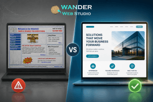
Now, look at discount or coupon websites. They are packed to the brim with flashing colors, banners, screaming text, and chaotic grids.
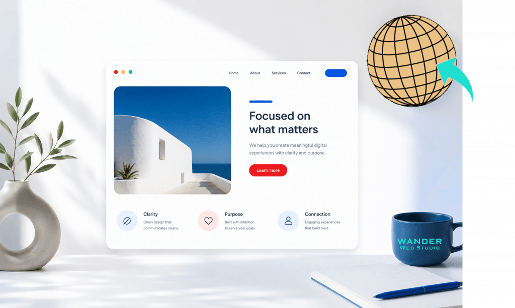
Generous negative space communicates confidence, elegance, and premium quality. It tells your audience that your message is so powerful it doesn’t need to shout for attention.
Wanderer’s Wisdom: The Luxury Art Exhibit
Imagine walking into a high-end contemporary art museum. A massive, beautiful white wall has a single, small painting hanging precisely in the center. The vast emptiness of that wall forces you to look at the painting. It makes the artwork feel incredibly expensive and meaningful. Now, imagine that same wall packed corner-to-corner with 200 different posters, fliers, and family photos. The individual value of each item drops to zero. Your website elements are your artwork. If you want a button, a headline, or a product shot to feel important, clear out the clutter. Let it command the room.
When you design with this level of restraint, you transform your platform into a cohesive business asset. For an interactive look at how we merge high-speed technical performance with minimalist, luxury design structures, explore our framework on the Wander Web Studio About Us Page.
To ensure your website features the healthy breathing room necessary to maximize conversions, run through these essential layout checks:
The Macroscopic Check: Look at your page as a whole. Is there a clear, calming rhythm of color blocks and blank bands that breaks up your services, or does it feel like a continuous wall of noise?
The Tap Target Check: On mobile screens, ensure your buttons have a generous margin of white space around them. If tap targets are crammed too close together, users will accidentally misclick, leading to massive user frustration.
The Headline Cushion: Ensure your subheadings have more empty space above them than below them. This visually anchors the heading to the text it actually belongs to, creating an intuitive flow.
By letting your layout breathe, you aren’t wasting space—you are investing in your user’s attention span.
Ready to streamline your layout and build a high-performing digital ecosystem that captures both human users and AI search engines? Take a look at our complete Wander Web Studio Services Page to see how we build fast, scannable platforms, or connect with our specialist team today.
Turn your website into a high-performance business tool.
Through our parent company, Cocha Technology Inc., we are officially multi-certified as: WBE | MBE | SBE | HABE
4321 Kingwood Drive, Suite 222
Kingwood Texas 77339
Phone: 281-607-0616
Email: info@wanderwebstudio.com
Operating on Central Standard Time (CST) | Serving Clients Across All Time Zones
Copyright © Wander Web Studio. All Rights Reserved.