Let’s step away from the technical wireframes, the clean lines of code, and the conversion metrics for just a second. Instead, think about your absolute favorite local coffee shop. When you step through that doorway, what keeps you coming back? It isn’t just the fact that they sell caffeinated liquid; you can get that anywhere. It’s the low, comforting hum of the acoustic playlist, the rich aroma of roasted beans, the textured brick walls, and the genuine smile from the person behind the counter.
It makes you feel something. It has a soul.
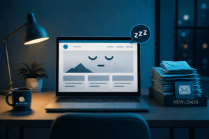
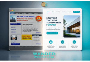
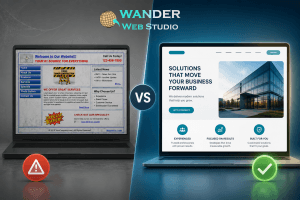
Now, look at the corporate internet. The vast majority of business websites feel like cold, sterile, fluorescent-lit waiting rooms. They use the exact same stock photos of smiling models in crisp suits, the same generic copy about “leveraging synergistic solutions,” and the same template-driven layouts. They are mathematically functional, sure, but they are completely devoid of personality.
In 2026, the digital marketplace is saturated with automated, AI-generated noise. Because of this, consumers have developed an incredibly sharp radar for inauthenticity. They don’t want to buy from a faceless entity hidden behind an abstract digital screen; they want to align with real people, real values, and real stories.
To stand out, your platform must transcend raw code. By embedding emotional design principles directly into your holistic website UX strategy 2026, you stop building cold digital brochures and start building an immersive experience that truly connects with your audience.
To understand how to inject a genuine human essence into a digital interface, we look to the foundational psychology established by cognitive scientist Don Norman in his landmark research on Emotional Design. He proved that human beings process experiences on three distinct evolutionary levels:
Visceral: The immediate, subconscious, biological reaction to appearance. (e.g., “Wow, this site looks breathtaking and clean.”)
Behavioral: The deep satisfaction that comes from seamless functionality and ease of use. (e.g., “This is so intuitive; it naturally knows exactly what I want to do next.”)
Reflective: The highest level of processing, where the user forms a conscious emotional bond, tells their friends about you, and remembers your brand long after closing the tab.
[Visceral Layer] ---> "This looks beautiful." (Instant Aesthetic Trust)
[Behavioral Layer] ---> "This works flawlessly." (Zero Cognitive Load)
[Reflective Layer] ---> "This feels like me." (Long-Term Brand Loyalty)
When you hire specialized website development services, the magic happens when these three layers are balanced simultaneously. If your site is beautiful but glitchy, the visceral joy turns to behavioral anger. But when you align stunning aesthetics with a “Lean and Mean” infrastructure, you create a space where deep user trust can flourish.
If you want a website to actually feel like you, you have to stop hiding behind generic stock photography. The second a prospect spots a staged, artificial photo on your homepage, their trust drops.
Show your real workspace. Show your team in action, messy desks, raw behind-the-scenes moments, and authentic expressions. If your business is rooted in a specific location, weave that local texture into your graphics. For example, our structural layout and visual philosophy are deeply inspired by the vibrant energy of our roots, which you can read all about on our Wander Web Studio About Us Page.
When a user sees the real people behind the platform, it breaks down the digital barrier. Recent biometric behavioral research highlighted by the Norman Nielsen Group demonstrates that users look at authentic, personal photographs on websites for over 34% longer than generic stock imagery. Real human faces trigger mirror neurons in the brain, inducing instant empathy and a sense of shared community.
Your website’s text shouldn’t sound like a legal contract or an artificial corporate memo. It should sound exactly like you do when you are sitting across a table from a client, sharing a casual cup of coffee.
Review your functional system text. When a user fills out a form, does your site say, “Submission successful. Error 0. Data logged.”? That is a mechanical machine talking, not a human. Swap that dry, robotic cadence for humanistic micro-copy:
Instead of “Submit Form,” try: “Let’s Chat!”
Instead of “Error: Invalid Email,” try: “Oops! That email looks a little lonely without the ‘@’ symbol.”
Instead of “Success,” try: “Awesome, you’re all set! Check your inbox.”
These tiny textual interactions are incredible tools to reduce cognitive load UX while injecting lighthearted warmth. When your interface speaks like a friendly assistant rather than an unfeeling computer terminal, the entire user journey feels significantly less stressful and far more memorable.
Color psychology is a massive lever for emotional design. A luxury brand looking to project confidence and calm shouldn’t rely on aggressive, high-energy neon yellows. Conversely, a highly creative boutique shouldn’t flatten their entire site into a dull, corporate navy blue.
Every hue, transition speed, and functional element on your page dictates the emotional temperature. A slow, elegant fade-in as elements load creates an atmosphere of peace and intentionality. A playful, bouncy hover animation on a button creates an infectious burst of lighthearted delight.
Wanderer’s Wisdom: The Digital Welcome Mat
Think of your website’s home page as the front porch of your business. If a guest walked up to your actual house, you wouldn’t stand there silently staring at them, or hand them a 50-page brochure about your life accomplishments before letting them inside. You’d open the door, smile, offer them a comfortable seat, and ask how you could help them. Your digital home needs that exact same hospitality. Lay out a digital welcome mat. Keep the entryway clear, make your greetings warm, and make it instantly clear that you are incredibly happy they stopped by.
When your visual presentation aligns perfectly with your genuine operational energy, your audience experiences an unmistakable sense of alignment. According to global consumer trends analyzed by Harvard Business Review, fully emotionally connected customers are 52% more valuable to a business than those who are just “highly satisfied.” They don’t just consume your services—they actively cheer for your success.
At the end of the day, pixels are just a commodity. Anyone can assemble a generic template and put text on a screen. But building a digital platform that vibrates with your specific passion, your distinct point of view, and your unique personality? That is where art meets business strategy.
Look at your website this afternoon and ask yourself an honest question: If someone stripped away your logo, would your site still sound and feel uniquely like you?
Ready to step out of the template trap and build a platform with a real human soul? Browse our complete Wander Web Studio Blog for more creative brand strategies, or connect with our specialized team today to bring your unique digital story to life.
Turn your website into a high-performance business tool.
Through our parent company, Cocha Technology Inc., we are officially multi-certified as: WBE | MBE | SBE | HABE
4321 Kingwood Drive, Suite 222
Kingwood Texas 77339
Phone: 281-607-0616
Email: info@wanderwebstudio.com
Operating on Central Standard Time (CST) | Serving Clients Across All Time Zones
Copyright © Wander Web Studio. All Rights Reserved.