Have you ever clicked a button on a website, sat there for three seconds watching a completely frozen screen, and wondered, “Uh, did that actually work?” You click it again. Nothing happens. You click it a third time out of pure frustration, and suddenly the page breaks or throws an error. Within seconds, that micro-moment of friction has completely eroded your trust in that business.
Now, flip the script. Imagine you hover over a primary button and it softly glows, expanding just a hair to acknowledge your mouse. You click it, and it instantly transitions into a sleek, animated checkmark confirming your form went through. No guessing, no waiting, no friction. Just a satisfying sense of control.
That subtle magic is called a micro-interaction.
While massive layout overhauls and bold typography catch the initial eye, micro-interactions are the invisible glue that holds a modern user experience together. In 2026, static web interfaces feel broken to the modern consumer. People don’t just want functional websites anymore; they want platforms that feel alive, intuitive, and human.
By strategically integrating these small visual cues into your core website UX strategy 2026, you bridge the gap between human intent and digital execution, turning a boring utility into an experience your users will actually love.
At its core, a micro-interaction is a single, brief functional response triggered by a specific user action. They are everywhere once you start looking for them: the gentle vibration your phone gives when you flip a silent switch, the “pull-to-refresh” bounce on your favorite social media feed, or the progress bar that zips along while a file uploads.
According to global design usability data from the DEV Community, human beings possess an innate, evolutionary expectation for immediate physical feedback. When an action yields a visible response within 100 milliseconds, it satisfies our brain’s need for confirmation. When an interface fails to meet this speed window, anxiety sets in and user drop-off skyrockets.
Thoughtfully designed micro-interactions solve this by focusing heavily on three critical business outcomes: usability, emotion, and behavior.
One of the most effective ways to use motion is to subtly point your visitors toward their next logical step. Buttons should never feel “dead” when a cursor touches them. Implementing smart button hover effects is one of the easiest business website conversion techniques to implement, yet it yields incredible returns.
A/B testing datasets compiled by Monday Systems show that adding simple color shifts or elevation changes on a mouse hover can increase click-through rates by up to 37%. Furthermore, adding an “Almost There” loading state to a call-to-action button turned standard clicks into engaging milestones, leading to a 12% average lift in conversions.
[Static Button] ---> Micro-hesitation ---> "Did it click?" ---> Higher Drop-off
[Dynamic Button] ---> Instant Validation ---> "Task Complete!" ---> Higher Conversion
When you work with professional website development services, these minor animation timings are fine-tuned down to the millisecond. The goal isn’t to create an overwhelming theatrical display; it’s to provide an elegant, instantaneous nod that says, “Yes, I see you. We are on it.”
If there is one place where users consistently lose interest, it’s the contact or checkout form. Facing a long list of blank inputs creates instant fatigue. If a user spends two minutes filling out their information only to hit “Submit” and get a generic, red error message at the top of the page telling them they forgot a character in their phone number, they will often close the tab entirely.
Micro-interactions fix this through real-time, inline validation.
Instead of waiting for the user to submit the entire form, the interface provides gentle feedback as they type. Fill out a valid email address? A small, satisfying green checkmark fades into the corner of the input box. Forgot an “@” symbol? The box softly turns a muted amber hue before they click away.
This type of proactive guidance helps drastically reduce cognitive load UX by ensuring that errors are caught and corrected instantly. When processes feel fluid and interactive, complex systems feel significantly simpler, encouraging your prospects to finish what they started.
Beyond the functional mechanics of reducing errors and guiding clicks, these tiny design moments are an extension of your company’s brand voice. A luxury law firm might utilize refined, slow, confident fades to communicate stability and prestige. A creative marketing agency or local boutique might use an energetic, playful pop or smooth slide to showcase personality.
Data shows that 73% of users remember digital interfaces significantly better when they provide rich, dynamic feedback. It shifts the perception of your website from a cold piece of software to a helpful assistant.
Wanderer’s Wisdom: The Digital High-Five
Think of micro-interactions like the subtle social cues we use in real life. When you tell a friend some great news, you expect a smile, a nod, or a high-five. If they just stared back at you with a totally blank, unmoving expression, it would feel incredibly awkward, right? Your website shouldn’t have a blank expression either. When a user completes a task, buys a product, or signs up for a newsletter, give them a digital high-five. A tiny burst of confetti or a smooth, rewarding completion chime shows that you care about their effort.
When users feel acknowledged rather than ignored, their session durations lengthen, bounce rates plummet, and their overall satisfaction scores climb. For a closer look at how we blend intuitive architectural patterns with high-performance motion design, explore our approach on the Wander Web Studio About Us Page.
With all of this data pointing toward the power of animation, there is one massive trap to avoid: over-animating.
In 2026, strategic restraint is just as vital as creative execution. If every element on your webpage is spinning, bouncing, or sliding in from the left, you will destroy the user journey by completely overwhelming their visual processing speed. Micro-interactions must always support the user’s objective, never distract from it. They should fade effortlessly into the background of the experience while subtly amplifying the overall result.
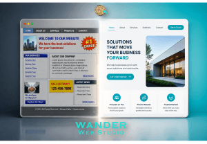
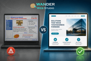
Take a look at your own business website today through a critical lens. Does it feel like a static digital brochure from 2012, or a living, responsive workspace built for 2026?
Ready to elevate your digital experience and build an interface your audience truly loves? Explore our comprehensive Wander Web Studio Blog for more tactical UX strategies, or connect with our specialized team to transform your site into an interactive conversion machine.
Turn your website into a high-performance business tool.
Through our parent company, Cocha Technology Inc., we are officially multi-certified as: WBE | MBE | SBE | HABE
4321 Kingwood Drive, Suite 222
Kingwood Texas 77339
Phone: 281-607-0616
Email: info@wanderwebstudio.com
Operating on Central Standard Time (CST) | Serving Clients Across All Time Zones
Copyright © Wander Web Studio. All Rights Reserved.