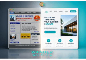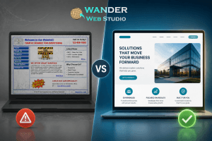
We live in an age of digital impatience. In 2026, you don’t have minutes to convince a visitor to stay; you have seconds. Specifically, you have about five of them. The 5-second test is a simple but brutal reality check for every business owner: if a user lands on your site and cannot tell exactly what you do and how you help them within five seconds, they are going to hit the back button.
This isn’t just a design theory; it is a biological reality. The human brain is wired to conserve energy, and processing a cluttered or confusing website requires “Cognitive Load” that most users simply aren’t willing to spend. Passing the 5-second test is entirely dependent on scannability. If your value proposition is buried in a beautiful but dense “hero” image or hidden behind poetic but vague language, you are losing money every single day.
Research in neuro-marketing suggests that users form an aesthetic opinion of a website in as little as 50 milliseconds. However, the 5-second window is where the brain decides if the site is useful. This is the “final exam” for all the hard work you’ve done on your Evergreen Content Strategy.
When a user lands on your page, their amygdala (the brain’s “security guard”) is asking two questions:
If your site is clear, the brain releases a small hit of dopamine, signaling that a solution has been found. If the site is confusing, the brain triggers a cortisol response, leading to frustration and an immediate exit (a “bounce”).
To pass the 5-second test, your website needs a clear visual hierarchy. You cannot expect the user to hunt for information; you must serve it to them on a silver platter. The user’s eye should move naturally and effortlessly to three key things in what design experts call “The Golden Triangle” of the hero section:
In 2026, scannability is the bridge to conversion. We no longer design for the “Leisurely Reader”; we design for the “Impulse Reader.” This user is scanning for keywords and visual cues that validate their search intent.
We use bold typography, strategic White Space, and high-contrast buttons to guide the user’s “impulse.” According to CXL (ConversionXL), the faster a user understands the value you offer, the higher their perceived trustworthiness of the brand. Clarity isn’t just about information; it’s about safety. When a user understands your offer instantly, they feel safe enough to engage.
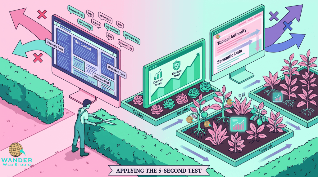
The 5-second test shouldn’t just be applied to your homepage. Every Pillar Page and blog post should also pass. In 2026, many of your visitors will find you through a specific cluster post, effectively making that post their “First Impression.”
If a user clicks through from a search engine and is met with a massive “wall of text,” they will fail the test and bounce, regardless of how good the information is. To fix this, use your “Visual Signposts”:
How do you know if you’re passing? Use the “Squint Test.” Look at your website and squint until the text becomes blurry. Can you still tell where the CTA button is? Is the largest piece of “blurred” text your main value proposition? If the answer is no, your visual hierarchy is off.
Another method is the 4-Step Content Audit. During your audit, view each page through the lens of a stranger who has never heard of your brand. Does the page immediately answer, “What is this?” and “Why should I care?”
In an era of “Zero-Click” search and AI-generated summaries, your website must offer a superior experience to keep users on the page. Scannability is your competitive moat. If your competitor’s site is a chore to read and yours is a breeze to scan, you will win the lead every single time.
At Wander Web Studio, we don’t just build websites that look good in a portfolio; we build sites that pass the 5-second test with flying colors. We ensure that your expertise is delivered with the speed and clarity that the 2026 market demands.
Wanderer’s Wisdom: I love performing “The 5-Second Test” with total strangers. I’ll open a client’s site, show it for exactly 5 seconds, close the laptop, and ask: “What does this company do, and who do they do it for?” You would be shocked how many times the answer is “I’m not sure, but the photos were pretty” or “I think they do something with business?” Pretty doesn’t pay the bills; clarity does. If a stranger can’t describe your business after five seconds, your website is working against you.
You have five seconds to make a choice: Will you be the solution the user was looking for, or just another tab they close? By prioritizing scannability, visual hierarchy, and clear messaging, you turn your website from a passive brochure into an active lead-generation engine.
Does your website pass the test? Let us give your site a scannability audit and turn those bounces into leads.
Turn your website into a high-performance business tool.
Through our parent company, Cocha Technology Inc., we are officially multi-certified as: WBE | MBE | SBE | HABE
4321 Kingwood Drive, Suite 222
Kingwood Texas 77339
Phone: 281-607-0616
Email: info@wanderwebstudio.com
Operating on Central Standard Time (CST) | Serving Clients Across All Time Zones
Copyright © Wander Web Studio. All Rights Reserved.