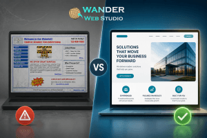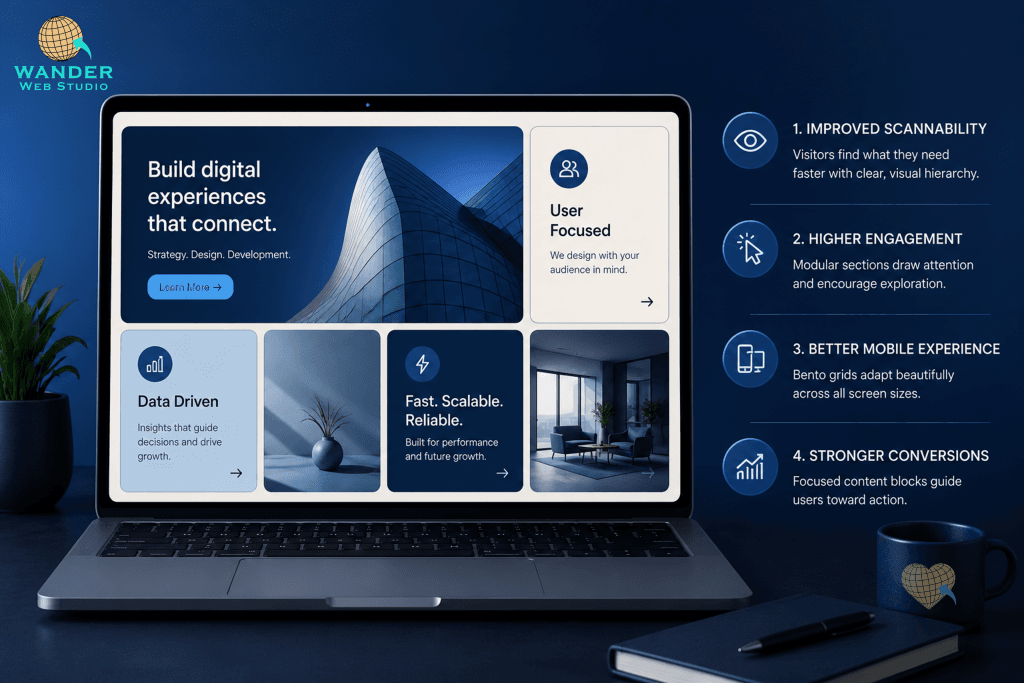
Picture a Japanese bento box for a second — little compartments, each holding something different, all fitting together into one tidy container. That’s basically the whole idea behind bento grid design, and it’s quietly become one of the most talked-about website layout trends of 2026. Instead of one long, predictable scroll, content gets broken into distinct blocks that sit next to each other, each doing its own job.
I will admit, when I first saw this trend picking up steam, I figured it was just another passing aesthetic. It’s not, though — or at least, I don’t think it is. It’s solving a real problem. People don’t read websites top to bottom like a book. They scan. They jump around. Bento layouts basically admit that out loud and design for it instead of fighting it.
So, what does that actually look like in practice, and is it worth building into your own site? Let’s get into it.
Here’s the thing about the long vertical scroll — it assumes a visitor will patiently move through your content in the exact order you laid it out. They won’t. Eye-tracking studies have shown for years that people scan pages in erratic, non-linear patterns, hunting for the one piece of information that matters to them.
Bento grids work with that instinct instead of against it. Grouping content into clearly defined blocks — services here, testimonials there, a stat that matters in its own little box — lets visitors’ eyes land wherever their attention wants to go. It feels less like reading, more like… browsing a shelf, I guess. GoDaddy’s own trend research points to exactly this shift, describing bento layouts as organizing pages “the way people naturally scan them” rather than forcing a linear path.
One thing I like about bento grid design- and this is a little bit of a personal opinion, so take it as that — is how well it handles the small stuff. A single testimonial. One key stat. A tiny icon that reinforces trust. In a traditional layout, those details often get buried between big hero images and long paragraphs. In a bento layout, they get their own compartment. Their own moment.
That matters more than it sounds like it should. We talked about this exact idea in our earlier post on tiny details that make users fall in love with your site — small, well-placed elements build trust in ways big flashy sections often can’t. Bento grids just give those details a proper home instead of squeezing them in as an afterthought.
This might be the most underrated benefit. Boxes of different sizes, naturally, draw different amounts of attention — a bigger block reads as more important, a smaller one reads as supporting detail. You get visual hierarchy almost for free, without needing heavy-handed color contrast or oversized buttons to force the eye where you want it.
If you’re already thinking hard about hierarchy on your site — and if you’ve read our post on visual hierarchy and your call-to-action placement, you probably are — bento grids are a genuinely useful tool to add to that toolkit. They let structure do some of the heavy lifting that copy and color usually have to carry alone.
Here’s the catch, and it’s a real one: bento grids look fantastic on a wide desktop screen and can get messy fast on a phone if the responsive behavior isn’t planned carefully from the start. The compartments that felt spacious and organized on a laptop can collapse into a cramped, confusing stack on mobile if nobody thought that part through.
This isn’t a reason to avoid the trend. It’s a reason to build it properly. A good mobile optimization pass — planned alongside the layout, not bolted on afterward — is what separates a bento grid that feels intentional from one that just feels broken on a small screen.
Probably not every site, no — I don’t think any trend deserves that claim, honestly. A content-heavy blog or a long-form article might still want the traditional scroll; forcing every page into little boxes can feel gimmicky if the content doesn’t actually fit that shape. But for homepages, service overviews, portfolios, anywhere you’re presenting several distinct pieces of information side by side? Bento grid design tends to shine.
Figma’s own trend coverage this year lumps bento-style modularity in with a broader move toward more expressive, less rigid grid systems across the industry — worth a skim if you want a visual sense of where this is headed: Figma, Top Web Design Trends for 2026.
A few quick questions to ask before jumping in:
If you’re sitting there thinking your homepage could use this kind of refresh but you’re not sure where to start, that’s honestly the most common place people land. Our design team builds this kind of modular structure directly into our website building and design packages, tailored to whatever your specific content actually needs — not a one-size-fits-all template.
Bento grid design isn’t going to fix a bad offer or a confusing message. Nothing does. But it can make a good message land a whole lot faster, and in 2026, faster and clearer is basically the whole game.
Turn your website into a high-performance business tool.
Through our parent company, Cocha Technology Inc., we are officially multi-certified as: WBE | MBE | SBE | HABE
4321 Kingwood Drive, Suite 222
Kingwood Texas 77339
Phone: 281-607-0616
Email: info@wanderwebstudio.com
Operating on Central Standard Time (CST) | Serving Clients Across All Time Zones
Copyright © Wander Web Studio. All Rights Reserved.