Imagine you’ve just walked into a high-end boutique in Houston. You’ve spent ten minutes browsing the aisles, you’ve found the perfect item, and you’re ready to buy. You look around for a cashier, but the counter is empty. You wander to the back of the store, then the front, but nobody is there to help you finish the transaction.
Eventually, you’re going to set that item down and walk out.
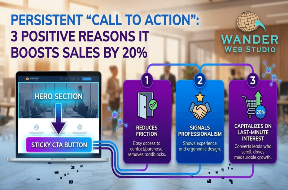
This is exactly what happens on your website when your “Contact” or “Buy Now” button is buried at the very top of the page. Once a user scrolls down to read your story, your services, or your testimonials, you’ve effectively disappeared. In the digital world, we solve this with a persistent “Call to Action”.
As a web designer and developer, I’ve seen that making it easy for people to hire you isn’t “pushy”—it’s professional. In fact, industry data suggests that high-performing websites using sticky design elements can see a conversion lift of up to 20%. When you remove the friction of searching for a button, you make the “Yes” effortless.
The biggest mistake business owners make is assuming everyone decides to buy at the same time. Some users are ready to click the moment they see your headline. Others need to read your custom website solutions details, browse your portfolio, and see three five-star reviews before they feel comfortable.
If your visitor reaches that “Moment of Intent” halfway down a long blog post, they shouldn’t have to scroll all the way back to the top or down to the functional footer to find you. A persistent “Call to Action” acts as a digital concierge, standing by and waiting for the exact second your customer is ready to say “Let’s do this.”
Every second a user spends looking for your contact info is a second they spend reconsidering their decision. According to, “Friction” is the leading cause of bounce rates. By keeping your primary goal always in sight, you keep the momentum moving forward.
✦ Wanderer’s Wisdom: Your website shouldn’t play hard to get. A persistent button isn’t about being loud; it’s about being available. Think of it as a helpful assistant standing quietly in the corner of the room, ready the moment you have a question.
One of the most effective ways to implement a persistent “Call to Action” is through a sticky header. This is a navigation bar that stays fixed at the top of the browser window as the user scrolls.
For many of our clients in San Antonio and beyond, this sticky design ensures that the brand logo and the “Schedule a Consult” button are always visible. On a 6-inch mobile screen, this is even more critical. Because scrolling is constant on mobile, having a “fixed” point of reference provides a sense of security and ease for the user.
Beyond the header, we often use a Floating Action Button (FAB). This is usually a circular button that sits in the bottom right corner of the screen—the “Comfort Zone” for a user’s thumb. Whether it’s a “Click to Call” button or an “Open Chat” icon, this persistent “Call to Action” is the ultimate closer for mobile traffic. It ensures you never fail the Thumb Test.
A persistent “Call to Action” is a powerful tool for internal link siloing. Instead of a generic “Contact Us,” your persistent button can be contextual.
If a user is reading about your security services, the persistent button could lead them directly to your security infrastructure page. If they are looking at design, it leads to your portfolio. This type of intentionality doesn’t just increase sales; it helps search engines understand the most important “Conversion Hubs” on your site.
As a developer, I have to ensure these interactive elements don’t slow down your site. A “jittery” sticky header is worse than no sticky header at all. We leverage high-performance hosting and optimized scripts through our partners at Cocha Technology to ensure your global web performance remains lightning-fast, even with persistent elements active.
The Scroll Test: Scroll halfway down your longest page. Can you still see a way to contact your business?
The Thumb Test: On your phone, is the primary button within reach of your thumb?
The Contrast Check: Does your persistent “Call to Action” stand out visually from the rest of your content?
The Speed Check: Does the button load instantly, or does it “pop in” after the user has already started reading?
I often hear from business owners who worry that a persistent “Call to Action” feels too aggressive. My response is always the same: if someone is on your website, they want to be there. They are looking for a solution to a problem. Making that solution easy to access isn’t pushy—it’s helpful.
Think of it like the “Next Episode” button on Netflix. It doesn’t force you to watch; it just makes it incredibly easy to keep going. When you implement a persistent CTA, you are simply smoothing the path for a customer who is already interested in what you have to say.
✦ Wanderer’s Wisdom: A great custom web design is an exercise in empathy. Put yourself in your customer’s shoes. If they are inspired by your blog post, give them a way to act on that inspiration immediately. Success is found in the absence of obstacles.
In 2026, the competition for attention is fiercer than ever. If you make a user work to find your “Contact” page, you are effectively handing that lead to a competitor who made it easier. A persistent “Call to Action” is one of the simplest technical changes you can make to see a measurable increase in your Website ROI.
Whether you need a “Sticky Design” refresh or a full user journey audit, Wander Web Studio is here to ensure your digital storefront is always open and your “Buy” button is never out of reach.
Is your website playing hard to get? Contact Wander Web Studio today, let’s put your “Call to Action” exactly where it belongs: in front of your customers.
Turn your website into a high-performance business tool.
Through our parent company, Cocha Technology Inc., we are officially multi-certified as: WBE | MBE | SBE | HABE
4321 Kingwood Drive, Suite 222
Kingwood Texas 77339
Phone: 281-607-0616
Email: info@wanderwebstudio.com
Operating on Central Standard Time (CST) | Serving Clients Across All Time Zones
Copyright © Wander Web Studio. All Rights Reserved.