DIY Website Templates: 5 Costly Ways They Flatten Your Brand

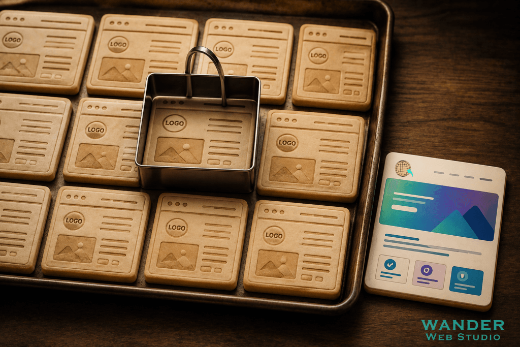
DIY website templates visual showing a baking tray of identical cookie-cutter website wireframes next to a vibrant, custom-designed card by Wander Web Studio.

DIY Website Templates: 5 Costly Ways They Flatten Your Brand Somewhere out there, right now, three or four other businesses in your exact industry are using the same website template you’re considering. Maybe the same one you already have. Different logo, different colors maybe, but underneath — same bones, same layout, same “here’s our team” […]
Hire a Web Developer: 5 Smart Reasons to Skip the Shortcuts in 2026
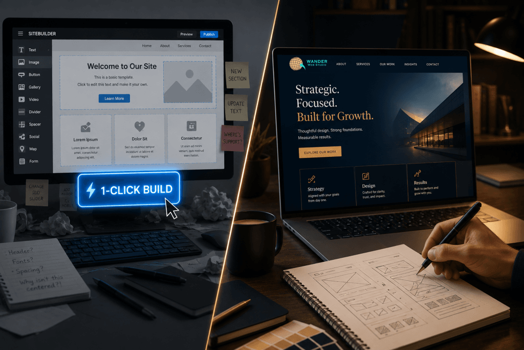
Hire a web developer comparison graphic contrasting a frustrating DIY template builder with a bespoke, strategic website created with wireframes and custom code by Wander Web Studio.

Hire a Web Developer: 5 Smart Reasons to Skip the Shortcuts in 2026 There’s a moment a lot of business owners hit, usually late at night, staring at a laptop screen. You need a website. You need it now-ish, or at least soon, and somewhere along the way someone mentioned you can just… build one […]

Website Trust Signals: 6 Powerful Ways to Get Chosen by Humans and AI
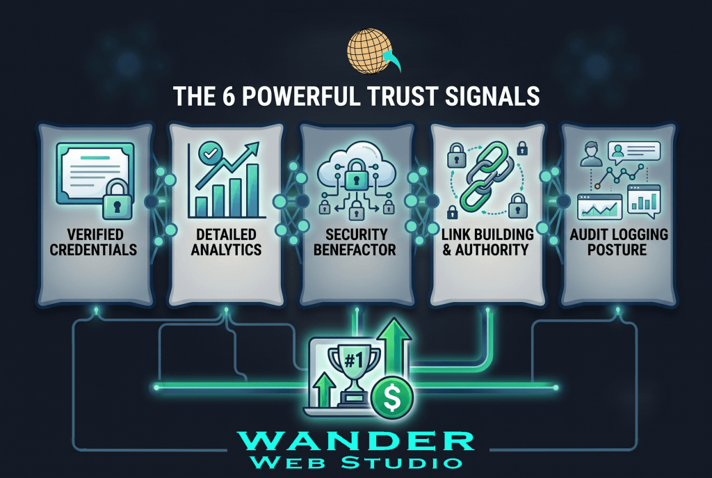
Website trust signals infographic highlighting six key credibility factors including verified credentials, detailed analytics, security, link authority, audit logging, and performance metrics that help businesses build trust with both human visitors and AI search engines.

Website Trust Signals: 6 Powerful Ways to Get Chosen by Humans and AI Something interesting happened this year, and I’m not sure enough business owners have clocked it yet. The things that used to just build trust with human visitors — credentials, reviews, a real bio, a security badge — are now also the exact […]

Bento Grid Design: 4 Brilliant Ways to Break Free from the Boring Scroll
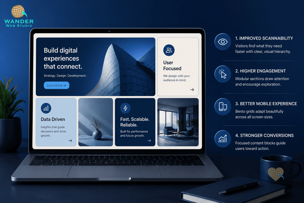
Bento grid design showcased on a laptop screen on a dark desk. The modular website layout features rounded rectangular tiles displaying headlines like "Build digital experiences that connect," "User Focused," "Data Driven," and "Fast. Scalable. Reliable." To the right of the laptop, four numbered key benefits are listed against a navy background: Improved Scannability, Higher Engagement, Better Mobile Experience, and Stronger Conversions. The Wander Web Studio logo appears in the top-left corner.

Bento Grid Design: 4 Brilliant Ways to Break Free from the Boring Scroll Picture a Japanese bento box for a second — little compartments, each holding something different, all fitting together into one tidy container. That’s basically the whole idea behind bento grid design, and it’s quietly become one of the most talked-about website layout […]

Custom Web Design: 5 Costly Signs Your Website Looks Just Like Everyone Else’s
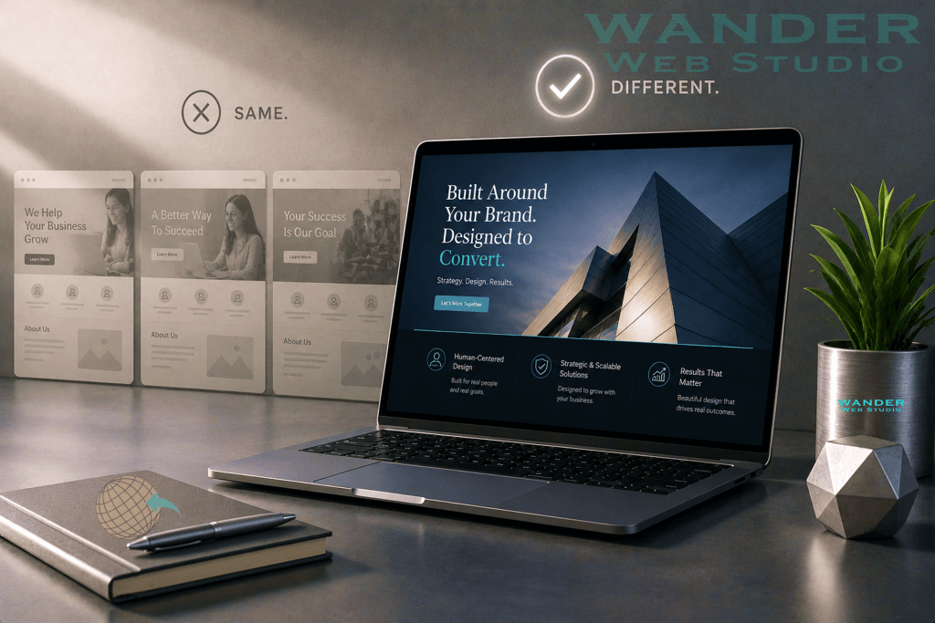
Custom web design comparison showing generic AI-generated website templates contrasted with a unique, professionally designed website on a laptop, illustrating how original branding and strategic design create a stronger customer experience and improve conversions.

Custom Web Design: 5 Costly Signs Your Website Looks Just Like Everyone Else’s? Open ten small business websites in a row right now. Go ahead, try it. Same hero section, same three-icon feature row, same stock photo of someone laughing at a laptop. It’s a little eerie, honestly. And it’s not an accident — it’s […]

AI Search Optimization: 5 Alarming Signs Your Website Is Invisible in 2026
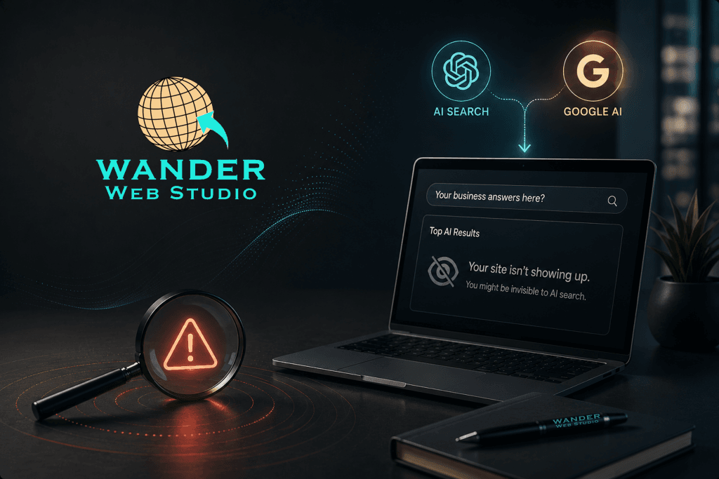
AI search optimization illustration featuring a modern website dashboard that fails to appear in AI search results, with ChatGPT and Google AI icons, a warning symbol, and a laptop representing website visibility, semantic SEO, and AI-powered search optimization.

AI Search Optimization: 5 Alarming Signs Your Website Is Invisible in 2026 Here’s an uncomfortable question. When someone asks ChatGPT or Google’s AI Overview a question your business could answer, does your website ever show up? For a lot of Wander Web Studio clients we talk to, the honest answer is “I have no idea.” […]

White Space is Not Empty Space: The Power of Breathing Room
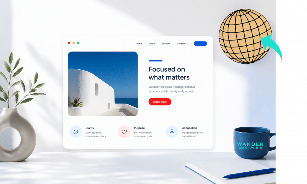
White Space is Not Empty Space: The Power of Breathing Room. A realistic digital mockup of a modern, clean website homepage displayed on a white wall workspace background. On the left sits a light beige circular ceramic vase with a green leafy branch, casting soft sunlight shadows. On the right, a navy blue coffee mug features the teal text "WANDER WEB STUDIO" alongside an open notebook and a blue pen. The website mockup features a navigation bar with links for Home, About, Services, and Contact. The hero section displays a striking photo of minimalist white Mediterranean architecture against a vibrant blue sea and sky on the left. The right side features the headline "Focused on what matters," a short paragraph, and a bright red "Learn more" button. Below the hero section are three feature columns with small icons labeled "Clarity," "Purpose," and "Connection." A large, stylized wireframe globe logo with a teal arrow is superimposed in the top right corner against the wall.

White Space is Not Empty Space: The Power of Breathing Room There is an old, lingering anxiety in the world of web design that haunts business owners and developers alike: the fear of blank space. When looking at a digital screen, it is highly tempting to treat every pixel like high-priced billboard real estate. If […]

Beyond Pixels: Building a Website That Feels Like You
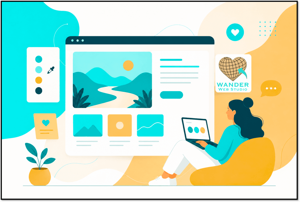
Beyond Pixels: Building a Website That Feels Like You. A colorful flat vector illustration displaying a modern web design workspace. On the right, a woman with dark hair tied in a bun sits comfortably in a yellow beanbag chair, working on a laptop. In front of her is a large mockup of a desktop web browser window showcasing a minimalist landscape image of mountains and a winding path under a yellow sun, alongside text blocks and a button. Below the main image are three smaller gallery thumbnail cards. Floating around the browser are design elements: a color palette tool with a dropper icon on the left, a small plant in a yellow pot, and a yellow heart icon card. The Wander Web Studio logo—featuring a heart-shaped wireframe globe with an aqua arrow—is displayed in a square tile on the right side. The background uses organic abstract shapes in vibrant teal, aqua, cream, and soft orange hues.

Beyond Pixels: Building a Website That Actually Feels Like You Let’s step away from the technical wireframes, the clean lines of code, and the conversion metrics for just a second. Instead, think about your absolute favorite local coffee shop. When you step through that doorway, what keeps you coming back? It isn’t just the fact […]

Stop Hiding Your Buy Button: 5 Visual Hierarchy Secrets
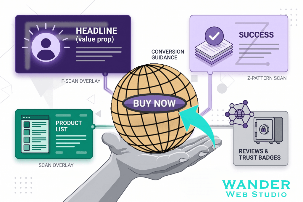
Stop Hiding Your Buy Button. A digital marketing graphic on a white background detailing website conversion hierarchy. In the center, an illustrated open gray hand holds a large wireframe globe icon with a bright aqua-teal arrow curving upward toward a purple oval "BUY NOW" button layered on top. Surrounding this centerpiece are four distinct, stylized feature cards linked by thin lines. The top-left dark purple card features a user icon under the text "HEADLINE (value prop)" labeled "F-SCAN OVERLAY". The bottom-left dark green card shows an interface mockup labeled "SCAN OVERLAY". The top-right light purple card displays a checked document stack labeled "Z-PATTERN SCAN". The bottom-right gray card shows a secure safe under the label "REVIEWS & TRUST BADGES". The Wander Web Studio logo text is positioned in the bottom right corner.

Stop Hiding Your Buy Button: 5 Visual Hierarchy Secrets Let’s be entirely honest: you didn’t build your website just to have a pretty digital placeholder on the internet. You built it to drive action. Whether you want a visitor to purchase a product, book a strategy call, or download a premium asset, your ultimate goal […]

Midnight Aesthetic: How to Design a Luxury Dark Mode Site
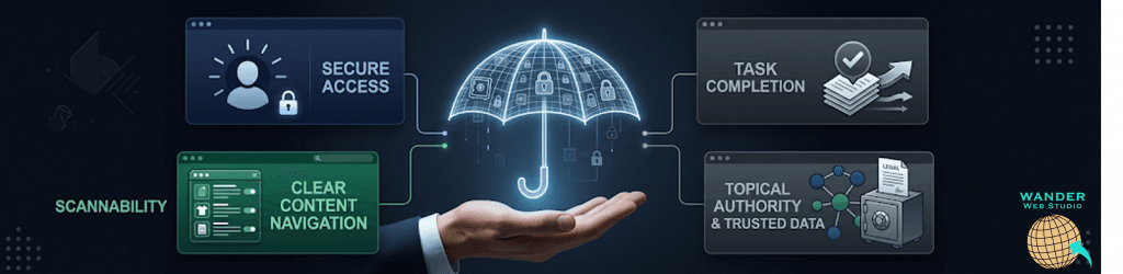
Midnight Aesthetic: How to Design a Luxury Dark Mode Site. A panoramic digital marketing graphic set against a dark premium luxury background. In the center, a businessman's open hand supports a floating, glowing neon blue wireframe umbrella embedded with miniature security padlock icons. Branching out from the central umbrella are four sleek, dark-themed user interface cards representing website features. The top-left card shows a user profile icon with the text "SECURE ACCESS". The bottom-left dark green card illustrates an interface layout with toggles and the text "CLEAR CONTENT NAVIGATION". The top-right card shows a checked document stack with an upward arrow and the text "TASK COMPLETION". The bottom-right card features a node graph connecting to a locked safe under the text "TOPICAL AUTHORITY & TRUSTED DATA". The word "SCANNABILITY" appears in green text on the far left, and the Wander Web Studio globe logo is placed in the bottom right corner.

Midnight Aesthetic: How to Design a Luxury Dark Mode Site There is a distinct shift that happens when the sun goes down. The bright, high-energy bustle of the day gives way to something quieter, more refined, and undeniably premium. In the digital world, this atmosphere is captured perfectly by a design trend that has evolved […]

Accessibility